Passion, quality and taste, since 1997
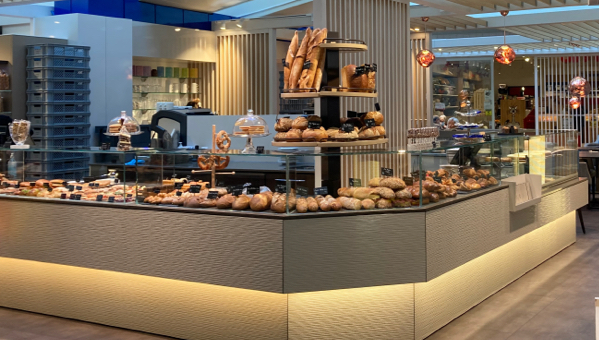
Christian Boillat has been a confectioner, chocolate maker and caterer since 1997. It has gradually expanded in the region with shops in Signy, St-Prex, Morges, Crissier and Lausanne. This family business centralizes all its production in St Prex.
Packaging in the image of their products, our graphic designers have been involved in the creation of packaging for the products of the Christian Boillat catering business.


A search for wording to accompany the product packaging.
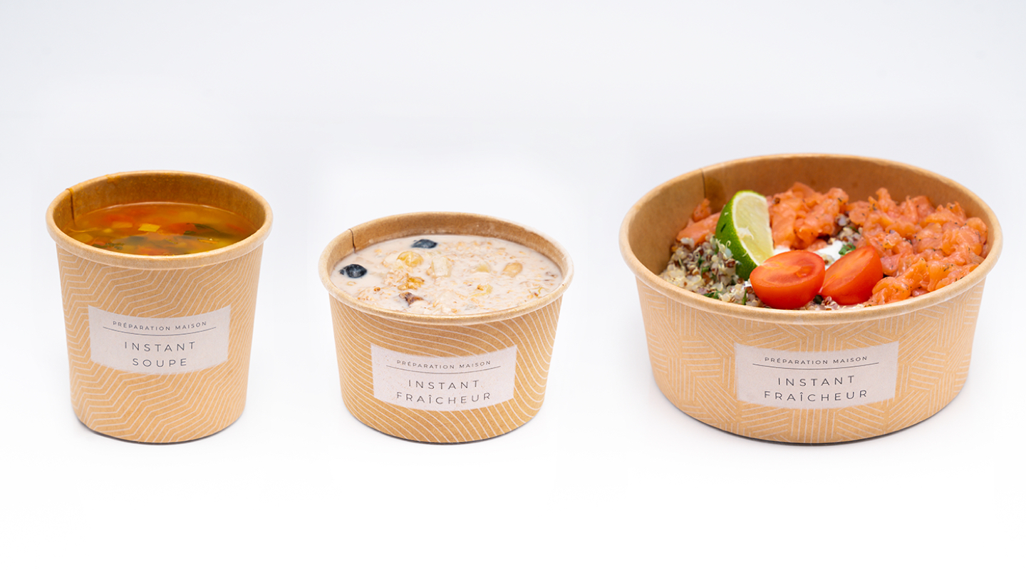
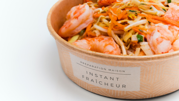
In designing these packs, our graphic design and copywriting teams have also thought about the wording for the titles of each product range. Indeed, it is about salad, fruit salad / bircher and soups. Our artistic direction wanted to standardize by type of pack, but also to bring back the values of the brand: an offer of precious moments, authenticity, greed. Two terms were chosen for the packagings, firstly the term “instant freshness” intended for sweet and salty products and secondly the term “instant soup” intended for soups. The term “instant” was selected among the different tracks, because it designates a shared moment, a precious moment in the day, the choice of a local lunch, of quality and with gourmet products.


Declination of the branding adapted to the packagings
Our graphic designers made several graphic proposals including a branding recognizable only by their labels, or a branding done directly on the packs in order to create a brand identity around these lunches while translating the authentic, clear, dynamic, while remaining traditional values.
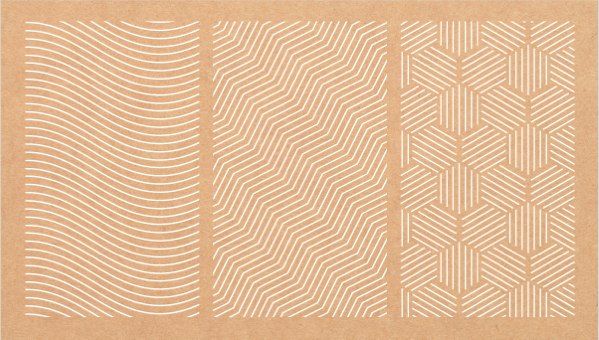
The chosen track was white printing on the kraft pack bringing a luxurious notion of quality. Our graphic design team used different motifs according to the types of products: soups, freshness (caterer) for the salads and freshness (confectioner) for the desserts. Thus the packs have a recognizable visual identity, allowing a quick identification while keeping the whole quality of the products on the long term.

Graphic and informative details
An additional sticker is placed on the lid during production in St Prex to specify the contents and ingredients. This additional sticker at the time of production avoids spoiling the packaging if the recipes change or if the quantities produced are different. A second style of sticker was created by our graphic design experts for a new range of products in glass jars. The idea was to extend the visual identity created on the kraft on the glass while having a closing function by the sticker that extends from the lid to the front face (visible first by customers in the shops). The products in the glass jars are intended for freshness, stews and desserts. This graphic detail allowed to recreate the subtlety of the kraft packs and the recognition of the patterns and structure of the elements thanks to a transparency game.
We accompany you, from branding to customizing the packaging to your graphic identity. If you wish to create or renew the design of your product packaging, do not hesitate to contact our graphic designer team dedicated to the creation and design of your product packaging.

