Complete redesign of the visual identity
Lakeprod is the Photography and Video studio of the Habefast group. It has evolved a lot due to the evolution of our customers, our teams, but also our equipment and the different missions we have had. The initial identity was no longer adequate to show the impact, modernity, quality, efficiency and stability of our studio.
We therefore decided to proceed with a complete redesign, more readable, more contrasted.
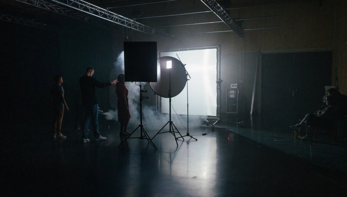

An identity that adapts
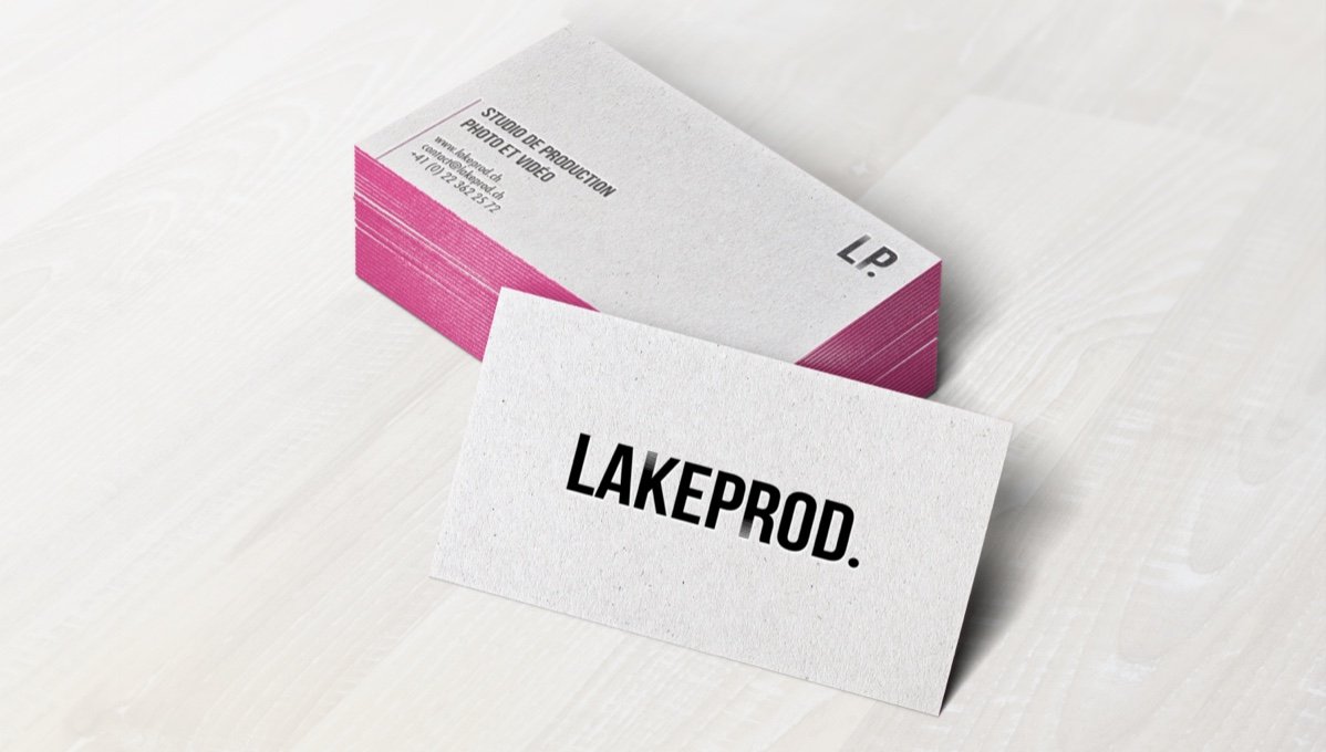
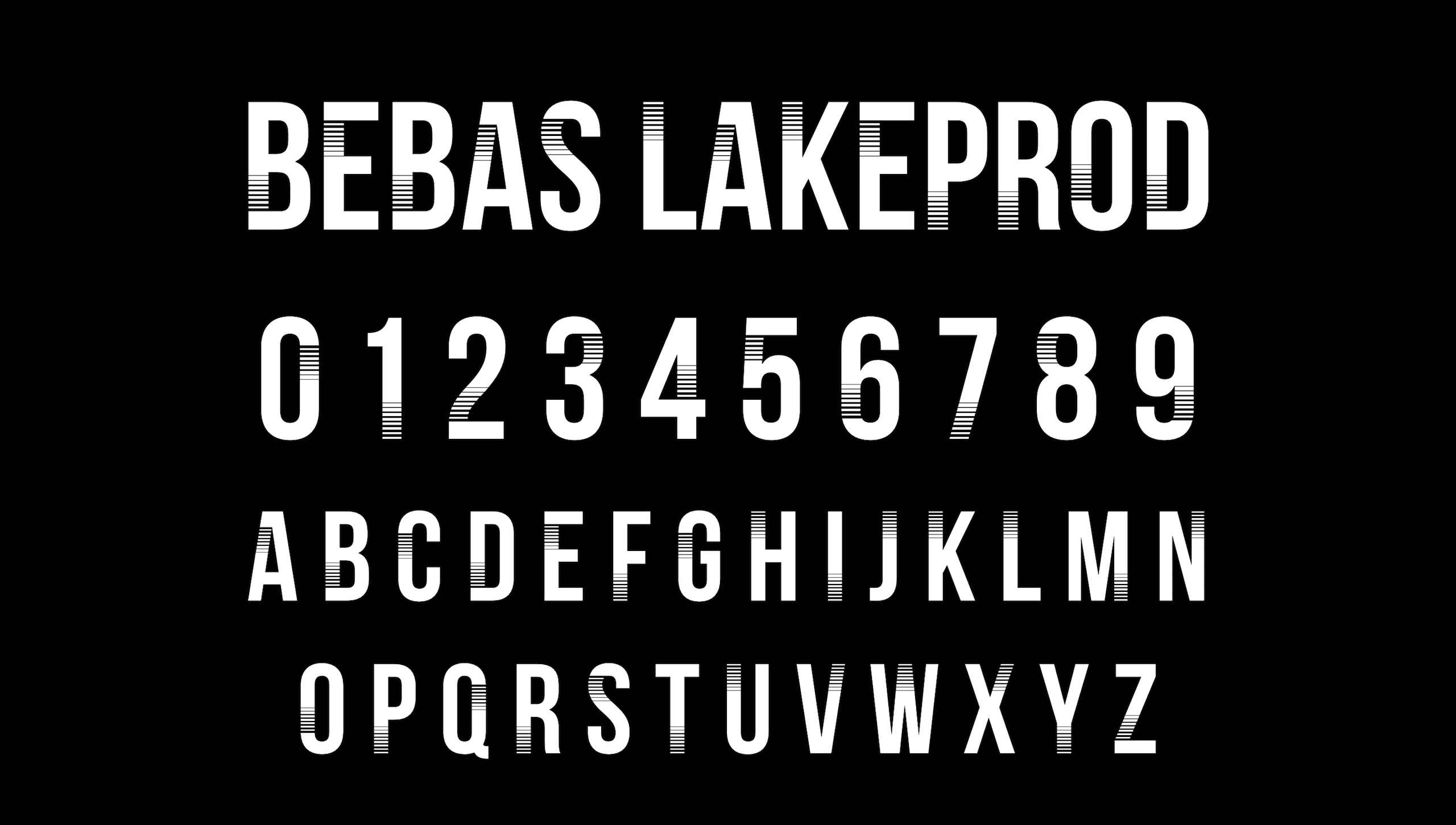
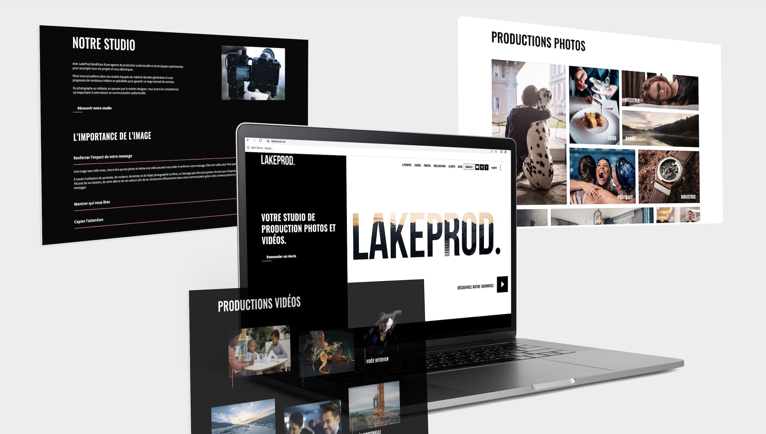
The choice of black and white as the dominant colors allows to really enhance the colors of the photos and videos without impacting their readability. For the more basic communication supports such as business cards or PowerPoint, we chose to associate a pink color, bright and flashy by small touch, the edges of business cards, lines or bullet points only. A big place is left to the image, especially on the website, because it is our core business and it must be visible. The specificity of the logo is based on the adaptation of the BEBAS typography. In order to keep this aspect of the identity, we have completely declined the font in order to use it on our different communication supports.
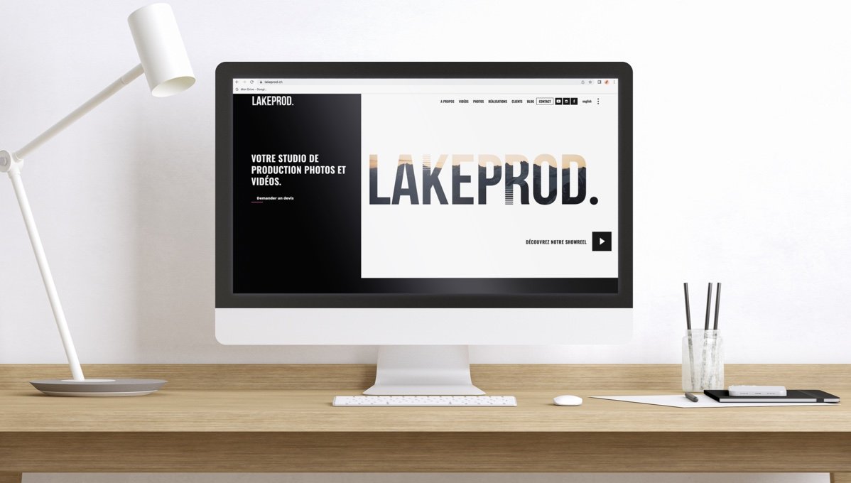
A dynamic, modern and original site with a predominant place of the image
The redesign of the site was to allow a better understanding of our skills, and therefore a better promotion of our photo and video projects, with mosaics that show our case studies in all their specificities. Do not hesitate to visit it to see more about our identity, but also to consult the different projects to get an idea of our skills.
An impactful digital version
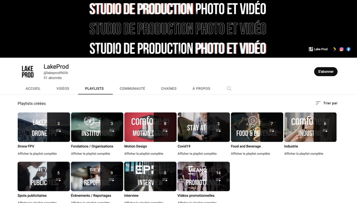
We obviously wanted consistency on our other digital media: YouTube, Instagram and LinkedIn in particular. Always with a desire to be impactful and in the continuity of the identity to identify our productions.
