Study case
Nestlé
Communication supports | Illustrations

Habefast alt

Inform, raise awareness, take action

Nestlé Waters is a subsidiary of the Nestlé Group and is the world’s leading producer of bottled water.

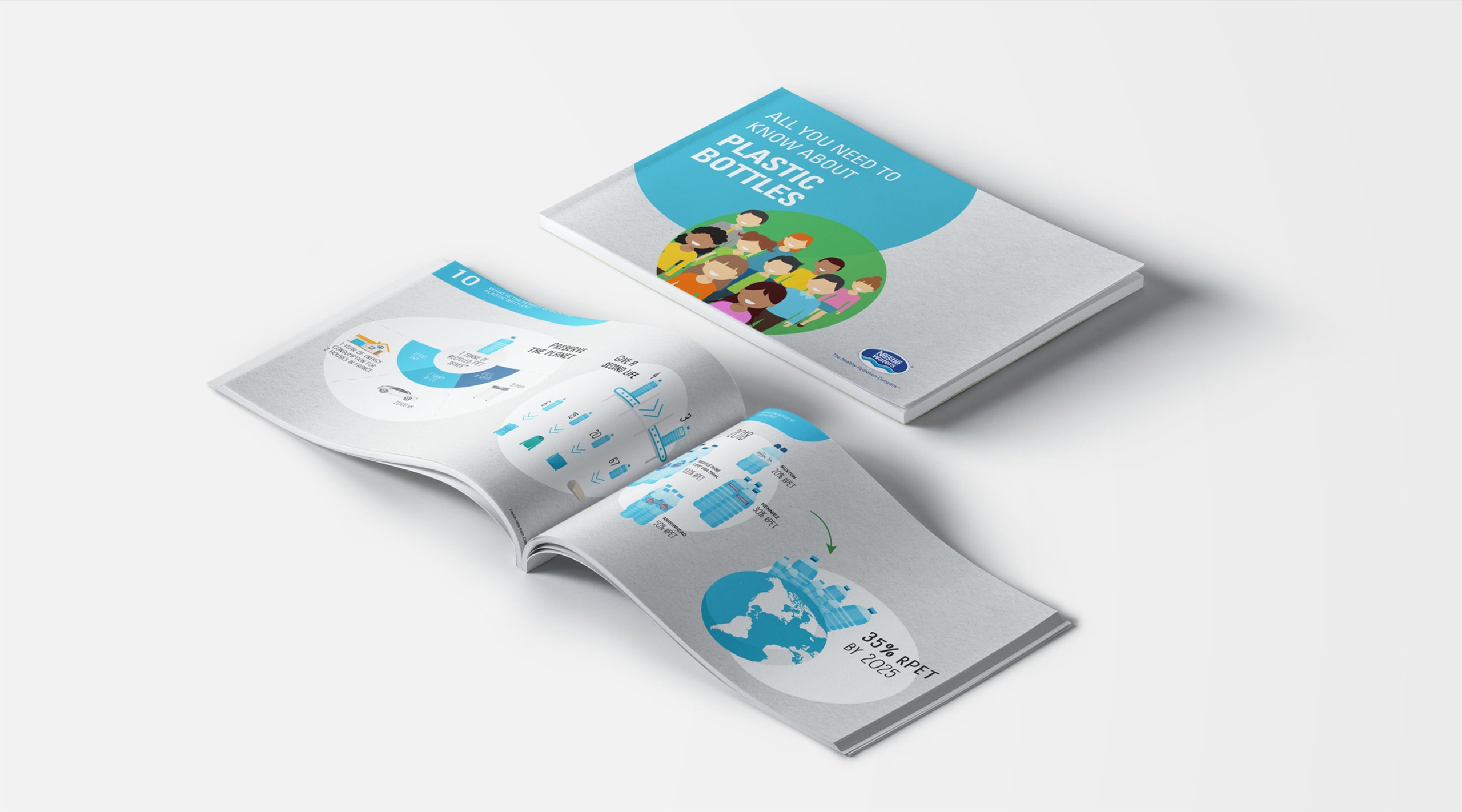
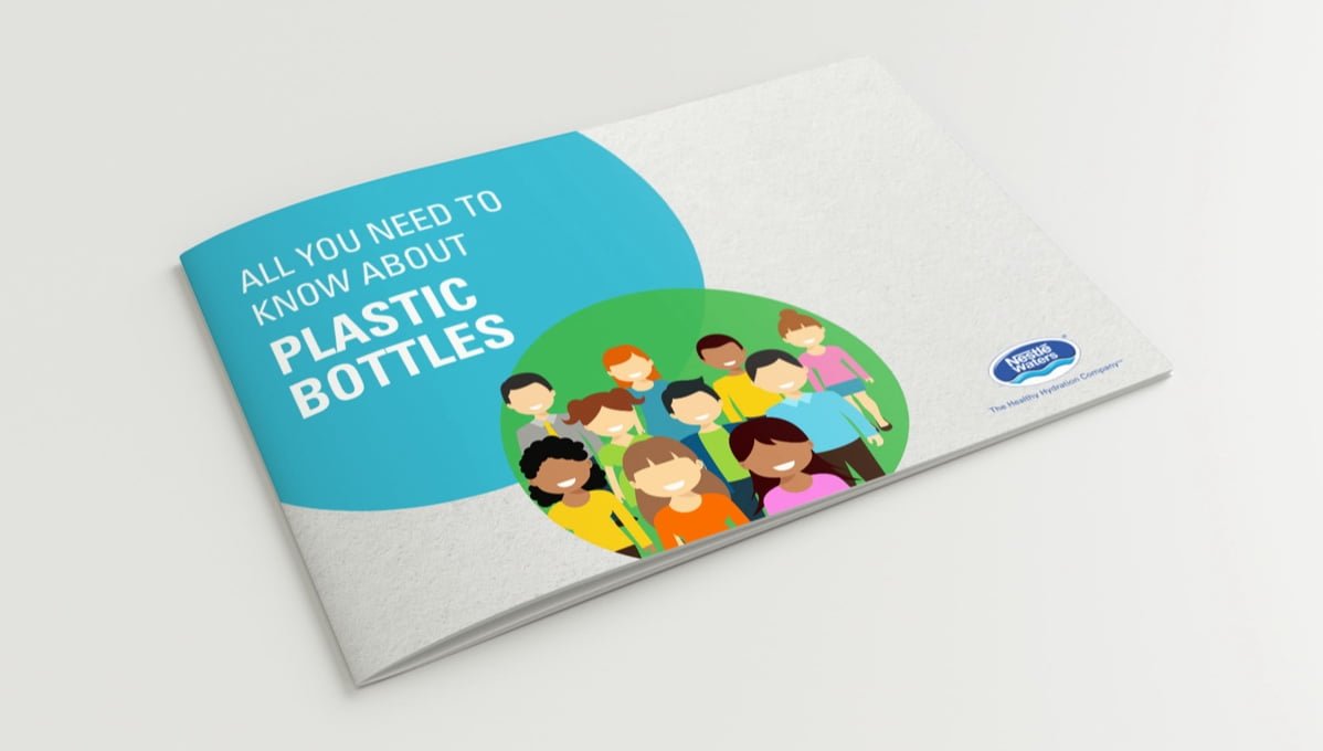
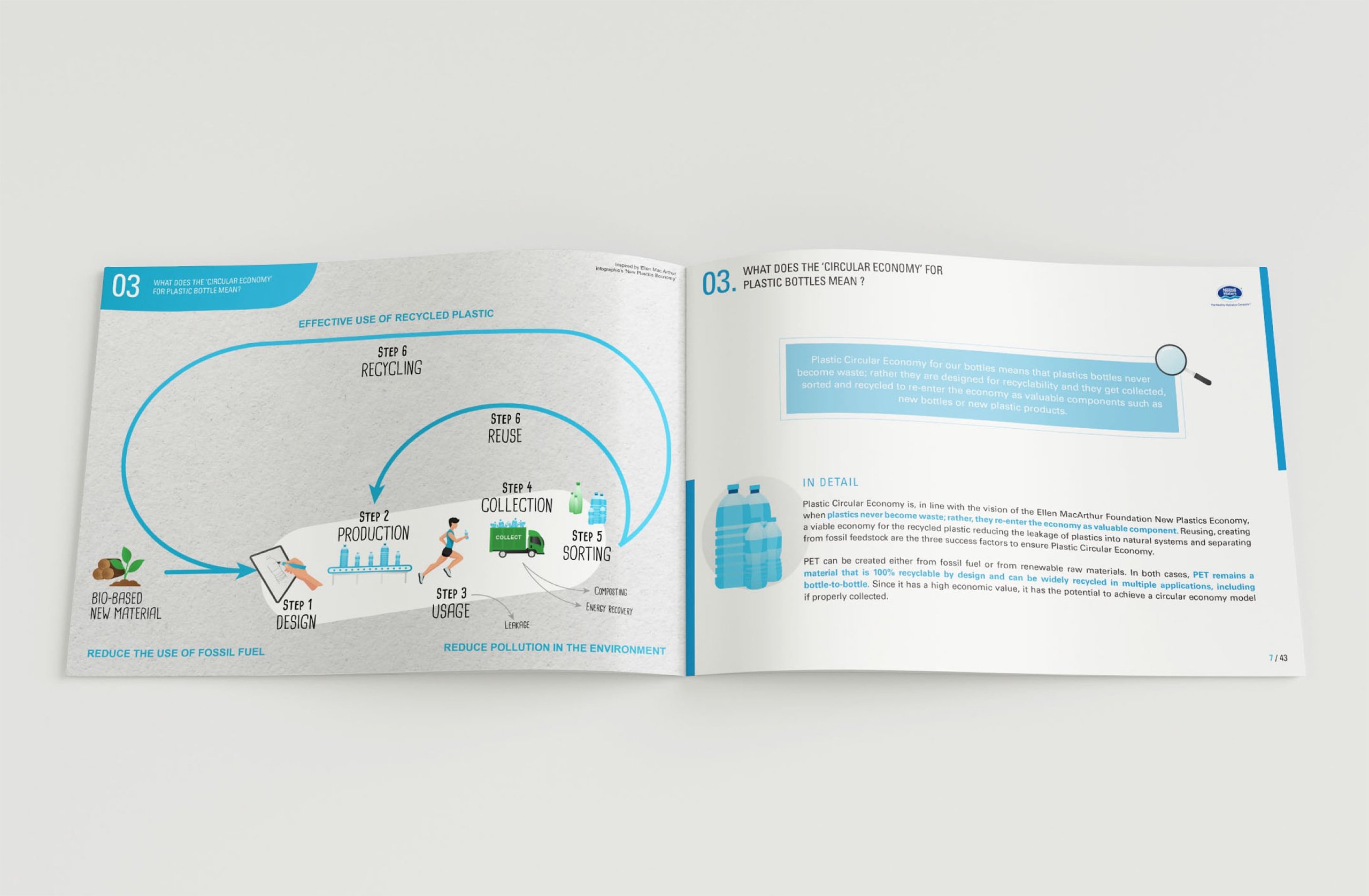
In order to raise awareness and inform all internal employees about the use of plastic bottles, Nestlé Waters wanted to distribute an information booklet in English, from the manufacturing to the recycling process.
Habefast Study Case Nestle Inform Raise Awareness Take Action
Habefast Study Case Nestle Making A Book Company

Create, model, print

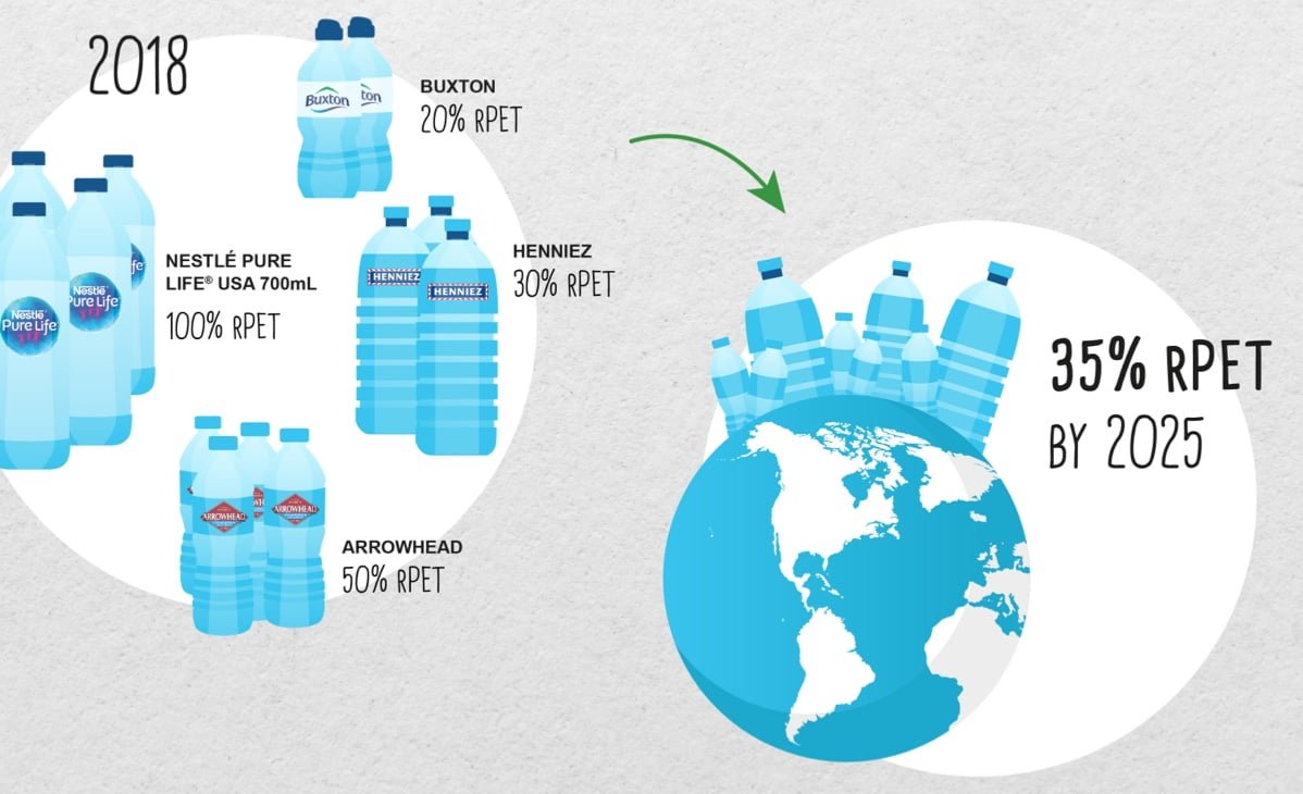
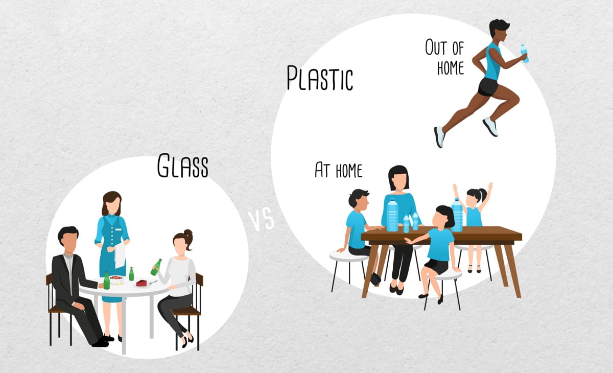
Given the size of the Nestlé Waters company, it was essential to respect a certain guideline, whether for the visual identity or the textual content. Our teams of graphic designers then used the colors associated with the Nestlé Waters brand image, namely blue and white, representing the logo but also water. We worked on the creation of multiple illustrations and diagrams to popularize the information and get the messages across in a direct and effective way. The booklet was designed to be clear and easy to understand. There are many color images illustrating the words as well as key figures. It is therefore quick to read because it is dynamic.  Our graphic design studio was delighted to receive very positive feedback from the client on the positive impact of this booklet on the level of knowledge of Nestlé employees around the world on the topic of plastic recycling. User buy-in is always the number one criterion for evaluating the quality of work of our illustrators, who must reconcile both the aesthetic aspects and the effectiveness of the message in terms of comprehension and memorization.
Habefast Study Case Nestle Create Model Print
Habefast Study Case Nestle Example Of Book Company Page
Habefast Study Case Nestle Example Of Book Company Page Plastic Pet Bottles 01
Habefast Study Case Nestle Example Of Book Company Page Plastic Pet Bottles 02
Habefast
5.0
Based on 18 reviews
powered by Google
Denis BurdetDenis Burdet
09:41 24 Jun 24
Super expérience avec l'équipe Habefast dans le cadre de la refonte de notre plateforme en ligne trOOdi.ch !Proactive et précise, l'équipe a vraiment été à notre écoute tout au long du projet et a su nous accompagner avec bienveillance.J'avais déjà vécu une très bonne expérience dans le cadre d'un autre mandat de branding relatif à l'identité visuelle de la marque Terre Vaudoise.
Yannick GrivelYannick Grivel
18:03 08 May 24
Le Triathlon de Nyon collabore avec Habefast depuis plusieurs années pour différents éléments. En 2024, ils sont refait intégralement notre site internet. Ils développement également la ligne graphique de chaque édition qui sont toujours originales et de qualité. Le suivi, la qualité et la rapidité d'exécution ou de réponse à nos demandes sont à relever. Je ne peux que les recommander les yeux fermés!
Bastien DrozBastien Droz
09:05 19 Apr 24
Super service et à l'écoute. Je recommande ce partenaire
Nathalie MarmierNathalie Marmier
07:36 03 Dec 23
😃 Je suis très heureuse de travailler avec toute l'équipe d'Habefast. Je me sens soutenue, écoutée et surtout comprise dans mes besoins. 🙏 Merci beaucoup. Je recommande cette agence.👍
Direction EPS RolleDirection EPS Rolle
13:49 15 Nov 23
Nous avons refait nos logos avec Habefast. Tip top, rien à redire. Service après-vente impeccable. A recommander.
Arborisme Leuba SAArborisme Leuba SA
14:06 20 Jun 23
Notre nouvelle marque, identité visuelle, ainsi que notre nouveau site internet viennent d'être terminés avec Habefast. Nous sommes ravis, c'est une équipe réactive, à notre écoute et de bons conseils ! Les visuels sont top, vous pouvez venir voir par vous-même ;)Nous vous les recommandons vivement !
Alexia HamelinAlexia Hamelin
16:40 01 Dec 22
Un très bon atout pour débuter et développer son entreprise : étude de marché au top, conseils avisés et perspicaces pour la suite, réactivité au top lors de grosses échéances. On se sent bien entouré et guidé, je recommande!
js_loader