Italian-style re-branding
Founded in 1979, by Marcello Krusi, Maison Via Roma is a shop, located in Geneva, offering leather goods and shoes made in Italy. Marcello Krusi’s daughter, Emanuela (Ema K.), has since taken up the torch, along with her mother Claudine, and has translated her passion for beautiful Italian materials into the design of all the brand’s collections.
In order to bring a modern touch to the brand, Maison Via Roma called on Habefast to rethink the logo while preserving the values and history of the brand.


Between quality and refinement
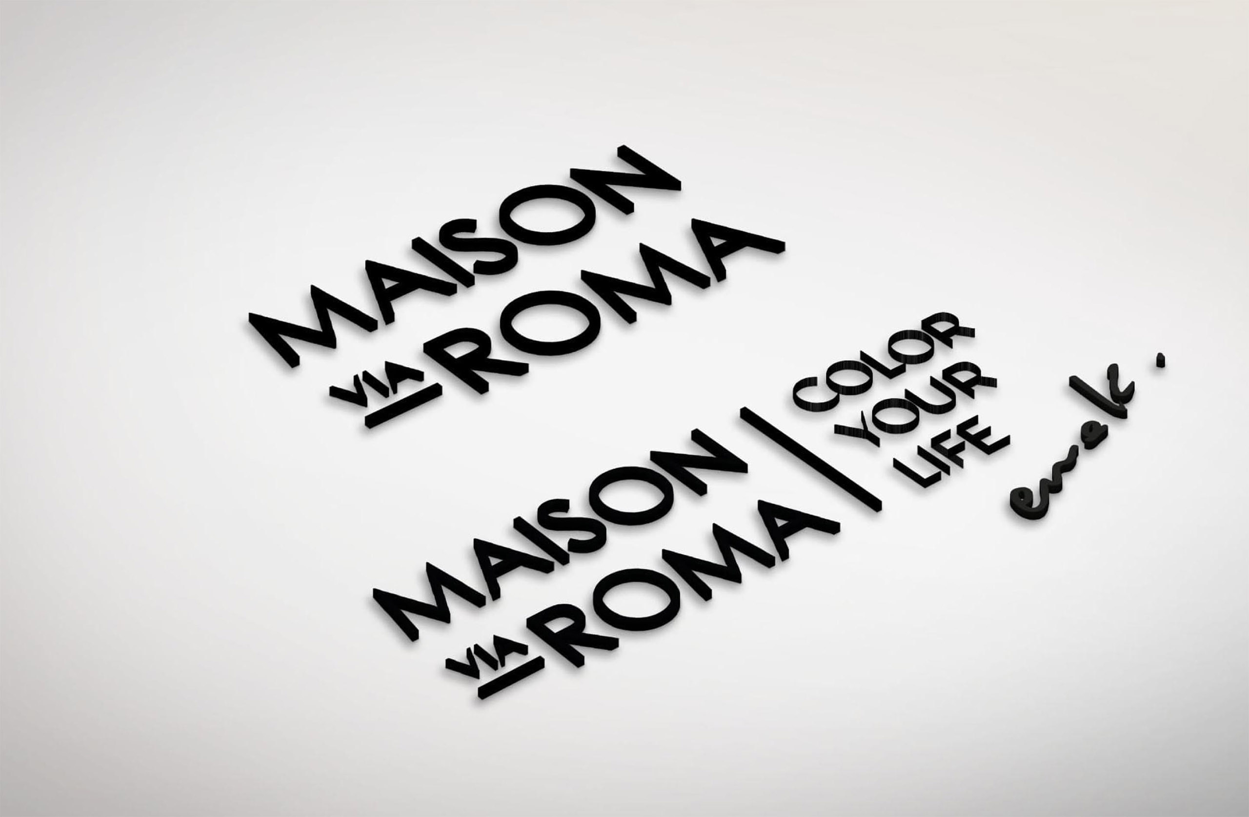
Simplification and minimisation are the key words that have brought a touch of modernity to the logo of this Italian company. A fine and sober typography has allowed to retranscribe the Italian elegance, the worked finishes and the femininity, while modernizing the brand image.
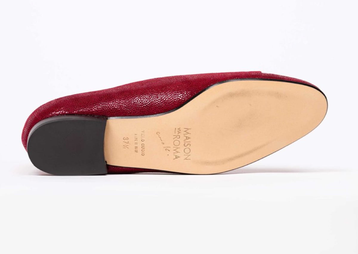
The designer’s name “Ema K.”, using her own handwriting, was also integrated underneath the baseline as a signature.


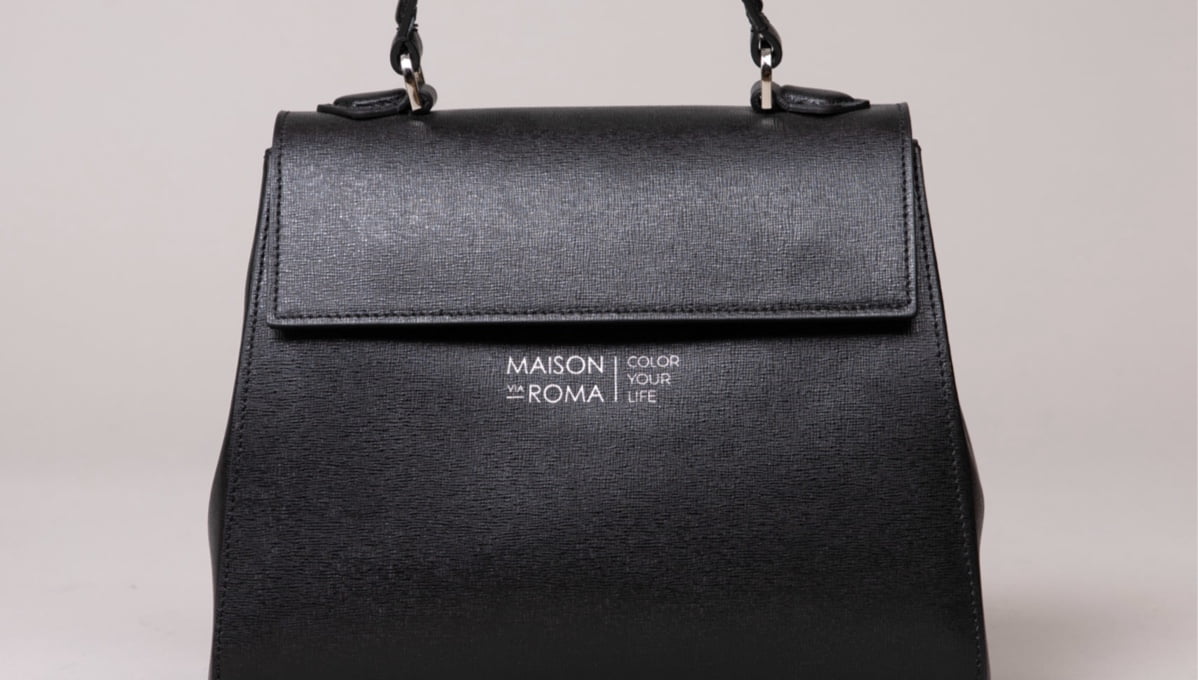
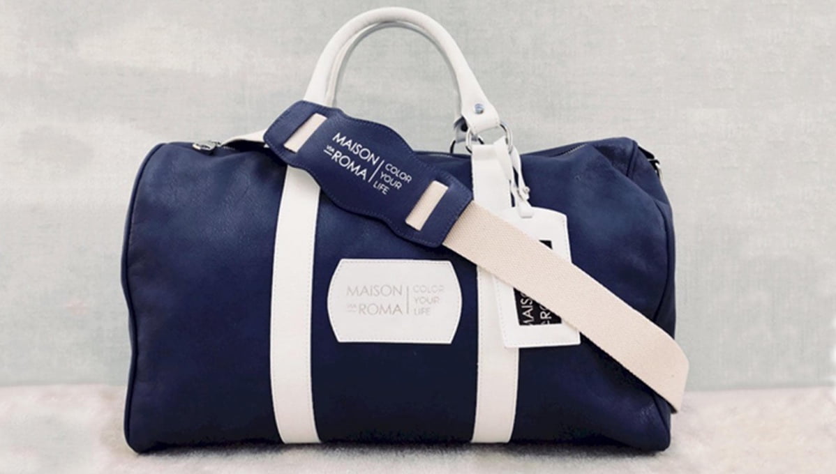
The new logo: the finishing touch to the Maison Via Roma creations
The black colour used, which reflects the codes of luxury, is a continuation of the previous logo. It also allows various uses on Ema K’s various creations.

