Typography | Habefast
Typography refers to the way in which words are shaped using individual characters and relief forms. The term typography comes from the contraction of “type” meaning “imprint” and “graphie” meaning “writing”.
Origins of typography:
Originally, typography was used for printing and the press. The relief was used with engravings on wood and then on metal to lay the characters on the paper with ink.
Secondly, typography nowadays is the use of fonts and typefaces as well as computer layout choices. There is a lot of talk about computer graphics and graphic design these days, and the typographic uses are endless and limited only by the imagination.
The value of typography in marketing:
There are many ways to improve your web content with typography. Indeed, typography plays a large part in the image and personality you present to the public, it is a crucial part of your visual identity.
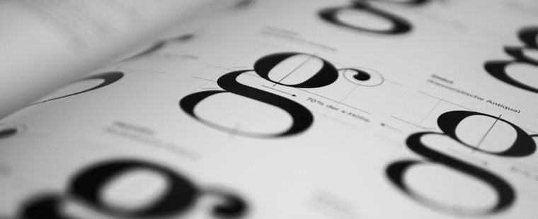
Each font or typeface has its own personality, thanks to the curves and shapes, you can deduce a particular universe. If the font has a lot of curves, is very rounded, with variations in thickness, then the font will have a “plant” look that will call to mind nature, ecology, simplicity…
A slanted font, i.e. an italic font, also has a fairly direct meaning. If the text leans forward, it gives an impression of speed. On the other hand, if it leans backwards, it gives an impression of slow motion. If the text is diagonal, two things can be inferred: if the text goes upwards, it gives an impression of progression. If it goes downwards, it looks more like a danger or a warning.
Secondly, you can choose a font that is very spaced out, or on the contrary very tight. This is used more for headlines or short sentences because the eye is not used to this type of font and it is difficult for it to read a “cross-linked” text in a fluid way. Spaced fonts are reserved for luxury brands, as they give an impression of prestige. Fonts with small spaces give a rather modern, innovative impression.
Finally, we can also find fonts that are bold, for example, to emphasise a part of the text, or light, to create an impression of discretion and secondary importance. In lower case or capital letters, the impression is also quite clear. A capital font will give an organised and linear impression, while a lower case font looks less official, more normal.
So you can play around with different typefaces for your corporate identity!